Monday, March 15, 2010

the armory show spring 2010

Recently went to the Armory Exhibit two weekends ago for the first time....was great to wander through the maze of galleries and see the works of all these both lesser-known and well-known contemporary artists! Here are a few artists I enjoyed:


The art of James Nares really caught my eye. Larger-than-life, sculptural brush strokes in creamy tones appear suspended in mid-splash against colored backgrounds.


Ghada Amer's canvases of acrylic and embroidery feature great textures with erotic motifs. "The submission of women to the tyranny of domestic life, the celebration of female sexuality and pleasure, the incomprehensibility of love, the foolishness of war and violence, and an overall quest for formal beauty, constitute the territory that she explores and expresses in her art" (-Brooklyn Museum)


George Rousse, a French photographer, creates anomorphic art, changing but only viewable from one viewpoint. He usually takes an abandoned, industrial site and systematically paints a design to create the desired illusion, correcting for the angle of the perspectives, slopes and ramps. (The space below was physically painted white to achieve the box)


Martin Kline predominantly uses encaustic, or dry pigments mixed with molten wax on his canvases, creating fantastically ridged and textured graphic pieces.


I was also weirdly obsessed with the taxidermed reverse-foodchain tower of animals. The expression of the cow makes this wildy ridiculous and entertaining! (Joaqim Schonfiedl)


Rhee Ki Bong's Wet Psyche series....mysterious and hauntingly beautiful trees painted on resin.
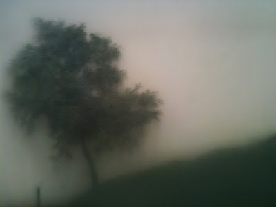

Lee Ufan is a Korean Japanese minimalist sculptor and painter. From Line. Simple but quite poetic.


Ian Davis, Skeptics. I love the playfulness of this piece on highway traffic.


Leon Ferrari, Untitled


Victoria Vasarley, Ipam


Phillip Cognee, Random Fields


And too many more to name....!


Sunday, March 14, 2010

you're so vane - vanity nightclub


Mr Important Design has just completed Vanity Club in Hard Rock Hotel, Vegas. Part jewelry box, part boudoir, the club's name alone speaks for itself as the driving theme for the interior. Glittery mirror and crystal-lain ceilings, plush velvet upholstery, and backlit imagery of sensual women create yet another palace of Vegas glamour.


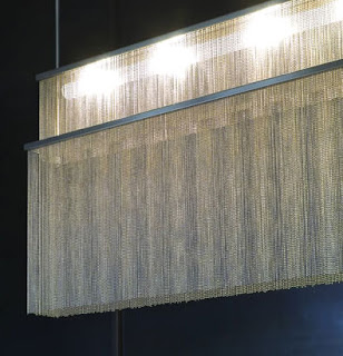
The framing of the bead curtain and embroidered cloth here is quite successful- the way that they are uplit really makes a beautiful, romantic effect. I also love the rippling effect of the ceiling [pre-cast tile or mirror? can't tell..]- it makes you feel like the room is underwater.


Also a fan of the honeycombed background. The way the pattern appears to continue past the ceiling and the back bar adds some visual curiosity as a layer between another world.


And of course, my favorite part of a high-end club.....the powder room. Yelena Yumchuk's photographs of women in the 1940s at the entrance are stunning, in addition to the large eye and lips graphics. The round individual mirrors and contrastingly white setting make a chic boudoir...perfect for fixing up makeup and gossiping with the girls.


[via yatzer]
[via mrimportant design]

Thursday, March 11, 2010

Kim Høltermand


Kim Høltermand is a Danish architectural photographer who recently was interviewed in Archinect. I am fascinated by his photos because of his uncanny ability to capture a certain moodiness of all the buildings he photographs, and also because of his focus on the much of the new Danish architecture that I visited in my time in Copenhagen. Here are his photos (left side), compared to my personal photos (right side). you can see the difference in his shot and quality of photos.

the black diamond royal library by schmidt hammer lassen architects. this was awe-inspiring in my first exposure to local architecture, as it the library is actually divided by a road, and connected by a skybridge. part of it is also connected to i believe an old royal parliament building from the 17th or 18th century. 


one of the VM haus buildings by PLOT iØrestaden, Denmark, a suburban area close to Copenhagen. This building is part of a complex of jarring modern architectural styles. This area has particularly been of interest for avant-garde public housing developments. 

seawater lido is a public swimming area on one of the canals in denmark, complete with diving boards and sunning areas. there are few "public pools" aside from the canals that citizens frequent during the summers.

grundtvigs church in bispeberg. one of the most beautiful churches i have been to- built in the early 1900s, it is both gothic and seemingly modern at the same time.

copenhagen airport by danielsen architecture. best airport hands down. makes you feel excited, relaxed and refreshed at an airport that doesn't have your typical store-in-box, sterile/corporate atmosphere.

Saturday, December 19, 2009

moroccan moment


the embroidery of these moroccan wedding blankets are exquisite..... the handcrafted wool rugs are painstakenly beaded with hundreds of sequins by artisans in berber villages. i would love to have one draped from the wall or as a bedspread. 


also in serious need of some moroccan candle holders or a birdcage/lantern. the effect packs a punch !


Thursday, December 17, 2009

luminara italy


luminara is an italian-based lighting design company that produces beautiful work inspired by the '60s and 70's. 

  vo
voodoo ceiling lamp


pasha
shine suspended
gio suspension 18 lamp


Tuesday, December 15, 2009

medusateam


the works of spanish studio medusateam are full of sexy, colorful graphics. their breadth of work covers prints, animation, and illustration...... their showreel especially makes me want to go back to doing animation and graphic design. i've been away too long from the adobe creative suite and 3dmax!! 


chair in space

obsessed with this ad from toshiba! a danish modern chair was released up to space by helium balloon with a videocamera as "armchair viewing, redefined." this is particularly amusing because i had once bought the same type and color of chair on e-bay which i had to return upon receipt because the leg was broken. 

the chair took 83 minutes to reach almost an altitude of 100,000 feet and 24 minutes to fall back to earth after the balloon broke. pretty amazing...


Sunday, November 22, 2009

distrikt hotel preview


distrikt hotel has a fun concept supported with colorful montages of each neighborhood in nyc. set to open up in early spring, it has spun itself as a boutique hotel set to capture and celebrate each of the neighborhoods or "worlds" that define new york through its design and service.


lets hope they amp up the hotel rooms.......agree that the rooms are nice but not as eclectic as i would've thought. it would be hilarious to see what a williamsburg room would have....... red flannel bedspread, sneaker dirt-smearing kit, american smokes pack, deer head or antler reference.... hahaha love the picture below.


also, if there is a times square type, they should consider putting their toiletries in a complimentary fanny pack. along with having queen-sized i love NY duvet covers. just saying..